Last time I gave a brief introduction to FamilySearch’s iPad indexing app. Today let me talk about the unfinished edges. This is a beta app and the betaness is visible along all the edges.
The first detail that I noticed was the background, or lack thereof. In stark contrast to the luxurious background used by the Ancestry.com Ancestry app, FamilySearch Indexing for iPad uses a solid, off-white background.

When first I signed into the app I was given some instructions on indexing names. I imagine I would get different instructions if I were handed dates to index. When I went back to consult those instructions, they were nowhere to be found.
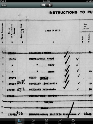
Location of the snippet is not marked in the whole document view. And it is not possible to enter the name while in document view, as one needs to if ditto marks are present in the snippet.

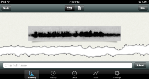
The worst part of the experience for me was the names I was given to index. I requested easy stuff, but what I got was beyond challenging. As can be seen in the history screen below, virtually every name was illegible. Some were marked through with thick lines. Some looked like the 3rd carbon copy of a typewriter. Others looked like they had been compressed too much, perhaps even multiple times. Some were too light to read. The couple I could barely read were from a European language that made me cry, “Vanna! I want to buy a vowel!”

I have a feeling I was getting all the names rejected by previous indexers. To be viable, the app needs a way of marking snippets as illegible. And when an image is skipped by an Easy indexer, don’t send it to the next Easy indexer, escalate it to a moderate indexer and then to an expert.
The app needs a way for indexers to pick batches by geographic area. I’ve spoken before about the role of context in indexing. I choose from among available projects locations for which I am most familiar with the place and people names.
Among those leaving comments online, registration and login are issues. Apparently, the grading system also does not work, as several users complained that the matched consensus count never increases above zero. Users also complained that the app doesn’t support landscape mode, although that bug seems to have been fixed in version 1.1, released 14 May 2012.
The app description says it all. “This app is in its early stages of development.”
My experience was very much the same as yours. I thought this was a great idea, but the names I got were impossible to read. I gave up after about ten minutes. It's a shame because I really think this is a worthy endeavor.
ReplyDeleteAgree with you. I would love to be a part of this effort, but I got very tired very quickly of being given completely illegible snippets or continually getting ditto marks that required bouncing back and forth between snippet and document view. If I could select what kind of records to work or records from areas where I have an interest and/or experience, I might have stuck with it, but alas I decided my efforts were better directed elsewhere.
ReplyDeleteYou can volunteer for projects of your choice. It takes some scrolling on the indexing screen so don’t just accept the project that pops up when you sign in ... have a look around. Familysearch offers their records free to everyone which makes it the most worthwhile site to volunteer our time to. Please persevere or phone the nice folks at the 1-800#. They are more than helpful.
ReplyDelete