FamilySearch recently released a pedigree view for Ancestral File and Pedigree Resource Files. So what do I think? (I’ll warn my friends at FamilySearch that now is a good time to don your thick skins.)
I confess I was a genealogy geek several years before I got out of primary school. In those pre-copy machine, pre-typing skills days I spent a lot of time hand copying family group sheets and pedigree charts from my parents.
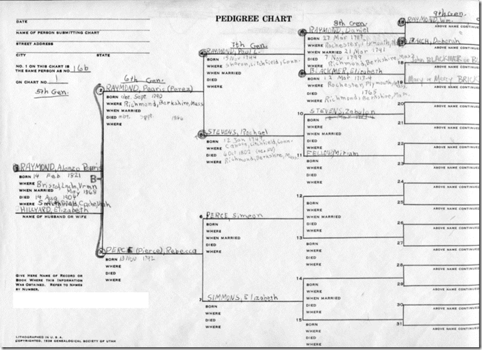
Here is what one of them looked like (less the last inch).

This was one of the few pre-printed forms offered by the Church of Jesus Christ of Latter-day Saint. It has full information on four generations: a birth and death date and place for each individual and a marriage date for each couple. The chart links by name and sheet number to the 5th generation. And it has the name of the principal person’s spouse. The consistent line spacing provided more than typewriter efficiency. The rigid binary layout made it easy, at a glance, to distinguish paternal and maternal ascendancy lines. One knew right where to look to see the mother’s father’s mother.
The chart is precisely optimized for ascendancy research.
With my background, I have a tremendous affinity to this chart. Prejudice regarding its form runs deeply in my veins. Giving an unbiased review of the current incarnation will be more than difficult.
Classic FamilySearch.org
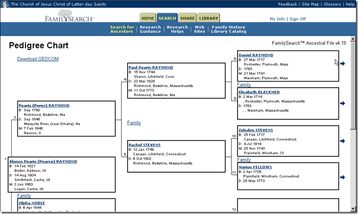
Here is the pedigree from the now defunct, classic FamilySearch.

The classic FamilySearch.org pedigree chart was obviously designed by someone schooled in genealogy (or at least in its clerical aspect). It contained identical information to the printed form in virtually the same layout. Building on the strength of technology, it replaced the link to the 5th generation with a clickable link and it added a clickable link to the family group sheet of each couple. Thankfully, it had enough space for full, unabbreviated place names.
Finally, the information for the entire pedigree and associated family groups could be downloaded—with a single click—for further analysis. (Like some of you, I was bitten more than once by wholesale merging of the information. But I digress…)
Current FamilySearch.org
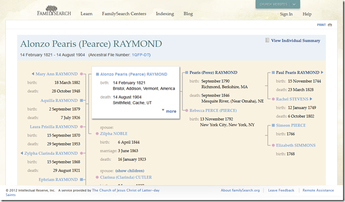
Here is the new pedigree view for Ancestral File and Pedigree Resource File:

It doesn’t include marriage information (except for the principal). It doesn’t contain place information for the 3rd generation. The mother is not positioned to line up with her parents, making quick interpretation less intuitive. The clearest deficiency is the lack of a 4th ancestral generation. After all, ancestry is the point of a pedigree, isn’t it?
It does contain the principal’s children, albeit without full information. It includes all the principal’s wives with a mechanism to choose which wife and children to highlight. This combines the utility of pedigree and family group charts. And it makes it easier to navigate for descendancy research. (Do you remember on classic how painful it was to navigate down the pedigree one generation?)
Above all, this is an improvement over not having a pedigree view at all.
So, what do I think about this pedigree design?
Ancestry File and Pedigree Resource File are not purposed to facilitate new research, but to communicate genealogical conclusions. This makes good charting capabilities and information transfer of prime importance.
Perhaps I am not representative of the genealogical community at large and newer genealogists are not prejudiced by old designs. Perhaps this page was never intended to serve as a pedigree chart, but as a navigation aid. Perhaps better charts are still to come. Perhaps scarce resources are better allocated to improving other aspects of FamilySearch.org.
Regardless, I feel this is a tremendous navigational improvement, a slight presentational improvement, but a tremendously wanting pedigree solution.
What do you think?
(Please leave a comment rather than replying to my e-mail.)
I agree, I have the same kind of past in doing family trees. Yes, I can see it would be good to get around IN, but if I am making a chart I would much rather have my old standby!
ReplyDeleteWith the ability to coreect old outdated info and to add sousrces to clarify the corrections, I am willing to forgo some of the past clarity in the lines and amount of them on the pedigree. Although it woud be nice to be more distinction in the lines and is something I hope to see also. in the future. The children and siblings have to count as a generation also especially for research help.
ReplyDeleteI don't like it! The different colors have no purpose and make it more difficult to see.
ReplyDeleteNothing lines up in a logical way for someone unfamiliar with the new format. They should stick with the classic genealogy form.
I do not care for it but I am from the old school and miss the ease of visually following a line. New does not always mean improved. As wonderful as FamilySearch.org is I sense they are losing touch with their core audience. Perhaps they should have a few 'dinosaurs' as consultants.
ReplyDeleteYeah, me too... am a dinosaur, I mean. I want the lines to follow. But, is it not possible for them to set it up both ways??? I'm sure someone using this as a newcomer would learn to adapt and then be stifled by our old style. I like the children - or is that siblings - list. Don't like losing a generation or two. Don't like losing the marriage data...
ReplyDeleteThe original Ancestral Tree Pedigree Chart is easy to see at a glance:
ReplyDelete1) what it is, ie Pedigree Chart
2) how the people are related to each other
3) the paternal and maternal lines
4) what information is missing
5) there is 'white space' for the eye to rest
Perhaps the reason people like the original Ancestral Tree Pedigree chart is that it is well laid out, there is consistency is where information is to be found, the linear design makes it very easy to follow and anyone, beginner or non-researcher, can follow it and is not overwhelmed by clutter.
The Classic Familysearch is easy to follow:
1) The generations and couples are easy to follow across the page
2) There is an easily seen link to 'family' which may lead to more information
The current family search is not easy to follow:
1) No title
2) The generations and couples are not easy to follow across the page
3) Colours are distracting and meaningless
4) Dates without places are not helpful. It is not obvious if the place is not known or omitted for chart space
5) Lack of marriage information
6) The paternal and maternal lines are not linear making it difficult to follow
7) Appears cluttered
8) No 'white space' for the eye to rest
9) A beginner or non-researcher would be overwhelmed by the entire form since one cannot 'see at a glance' the basic necessitites for context
Dear AI, I agree completely with you. I also like Lady Pamela's list of "not easy to follow"'s.
ReplyDeleteI agree on the loss of clarity and information. Especially where you state "Ancestry File and Pedigree Resource File are not purposed to facilitate new research, but to communicate genealogical conclusions. "
ReplyDeleteI agree also. It looks like it is designed to provide information on the primary person but with no help in following the ancestral lines. It is really terrible. Ring out the new bring back the old!!!
ReplyDeleteYes I am a traditionalist. I was a missionary at the FHL in 2005 when a programmer from the Family History department came to us and asked what a Family Group Sheet was. I was very disappointed. Then the department hired David Rencher as the department genealogist. They also hired another hotshot genealogist (name with held for security) as his assistant. However, I have not seen much of the "traditional" views retained. Ron Tanner is great at promoting this new thing and lots of the new ways of doing things are pretty good. However, I wonder why we are reinventing the wheel on some things when it has worked very well for decades. Just because we can does not mean that we should.
ReplyDeleteWe also have complained about the fonts and background colors making it difficult for those who do family history (geezers with failing eyesight) are having problems seeing. Kinda like spitting into the wind and expecting not to get wet.
Love your blog!!!!
I'm of the old school and feel that "if it ain't broke, don't fix it." The original format was clear, concise, and easy to follow. Black on white was easy to read and didn't tire one's eyes. The blue names on a shaded background are very hard on old eyes.
ReplyDeleteDLA in California
Hate the format, hate the colors, hate the lack of contrast.
ReplyDeleteHate the format, hate the colors, hate the lack of contrast.
ReplyDeleteI am not fond of this but folks Rome wasn't built in a day.
ReplyDeleteJust tried to use the pedigree view. Gave up after five minutes.
ReplyDelete