Without fanfare last Monday FamilySearch turned off the home page of its Classic.FamilySearch.org website, redirecting traffic to the current www.familysearch.org home page. (The old catalog remains available, however.)
Some users are not pleased with the retirement. Elaine Lee said, “Please can you tell me WHY you have RUINED a perfectly good website. I have used this website for 12 years and now find it so confusing.”
First released to the public in May 1999, the site was an instant success. The traffic load in the first few days was overwhelming and crashed the website.

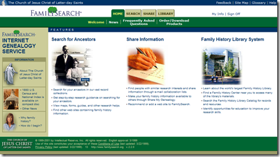
FamilySearch.org, May 1999
For many years, site navigation was enabled via four color-coded menu pages; the home page was green.

FamilySearch.org, June 2001
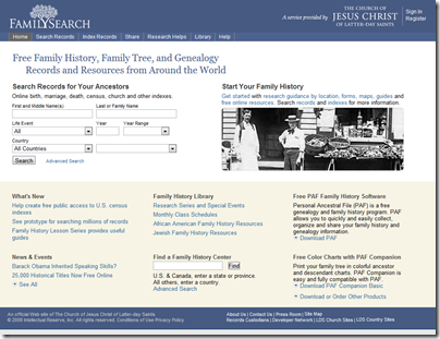
In later years, a search form was added to the home page and color coding was eliminating. This home page design continued until it was shut down Monday.

The original FamilySearch.org as it appeared in its final years
In December 2010, this original FamilySearch.org website became classic.familysearch.org. (See “Beta.familysearch.org Replaces www.familysearch.org.”) It was replaced with the current FamilySearch.org (not to be confused with new.familysearch.org, which will be replaced by FamilySearch Family Tree).
The original site was characterized by a search experience still favored by many individuals. The search strategy was simple: enter an individual’s name. If too many results were returned, add another piece of information to the search. Repeat until the result set was reasonably sized.
Back in February, FamilySearch gave users an opportunity to express their feelings about retiring the original site. Rochelle Edwards said, “Very disappointed to learn I can no longer access the old site. It was so much easier than the newer version (which I find extremely difficult) and can no longer find things which I could so easily find on the old site.”
I call the old site’s search paradigm “exact search.” Not all users found it intuitive. Beginners often entered both birth and marriage information, precluding results of both types. The current site implements a new search paradigm. Some users like it and some don’t.
Mike Fisher said, “Forget about the old site. The new site allows much better user defined search parameters. I find what I want, not what the old site allowed me to see. Plus the bonus of no patron submissions.”
What do you think? Was the old/classic/original site better, or is the current site?
But they could have waited till the IGI is fully searchable. This "coming soon" thing is just stupid.
ReplyDeleteI too find the old site preferable and I lament its passing. But that is the way life goes....we are so resistant to change because it takes time to get up to speed on the new. We all will take the time, of course, because we value the information, but we'll still grumble about it.
ReplyDeleteI have used the IGI search since its inception. I found the entire familysearch website invaluable for not just the IGI but the Library Catalogue to find out what records are available on film. It has always been the first place that I check – until this reworking of the website started.
ReplyDeleteOn the classic site I could so easily find what I was looking for, narrowed down to the area where I wanted to research.
The ONLY thing that I had on my wish-list for the classic site was for the patron entries to be removed from the IGI search. Patron Searches belonged in their own window.
I liked the simplicity, layout and colours of the classic site.
On the current site I search in the UK and get a bazillion entries from other countries. Yes, I can now dig deep and put in all sorts of filters. This takes a lot of time that wasn’t required before.
It seems as if the developers have not been listening to the users who have been consistent in their message that people loved the simplicity and look of the classic site. I find the current site cluttered and not eye appealing by layout or colour.
I am not lamenting change but I don’t understand why the classic site couldn’t be left while a new site was being prepared. As this ‘coming soon’ and items not yet included has made me take the short-cut off my desktop.
I am still a big supporter of the work that the Mormon church does with regards to records so I index for them. Their records are free for anyone to use on-line or modest user-fees to search films at any of their Family History Libraries regardless of religion. Indexing is fun and simple. You can choose the level you wish to index (ie easy, medium, etc) and you can also choose the projects you would like to volunteer for.
https://familysearch.org/volunteer/indexing
https://indexing.familysearch.org/projtab/current_projects.jsf
I like your outlook and positive take on this. I have see a few other blogs elsewhere with what seems to be unappreciative comments that overlook the fact that this is all free for us to use. Family Search seems to be trying hard to expand the capabilities of the site and to improve the user experience. There may be some frustration in learning to use the newer site, but part of the learning curve comes from the fact that there is so much more than we can do, and that makes it a bit harder to learn.
DeleteJust as I can do so much more with my new PC with a super-fast i7 processor, 10GB of RAM, and 1 terabyte of storage,that I could not have dreamed possible with my Apple 2e that I bought 30 years ago, this new site has all sorts of exciting functions for us in planning stages - things that would not be possible to do with the old site. It was great for what it was, but that was pretty much as far as it was going to go.
I to am sorry to see the old site go. I was a beta tester in both the original and the new and still preferred the old. It's to bad we can't have both. The old was much better in my opinion.
ReplyDeleteRon Riddle
I have to say something here I saw a statement that the new site had no submitter data..
ReplyDeleteBULL. I just found my mother's data that I submitted myself.. back in 2000.
I want the IGI extracted data - not some user submitted data file, like mine that I know now has incorrect data in it.
I like both but want to use the IGI extracted only - is there a way to get to it??
Nelda Percival
Yes, they've separated the extracted from the submitted. Both (or either) can be searched here:
Deletehttps://www.familysearch.org/search/collection/igi
I just entered the IGI page listed above. I put in the name of BOUVIER and only wanted to search Philadelphia, Pennsylvania, not the world.
DeleteWhen I put in a place name--no results were shown.
If I left it blank, 690,43 results come up. No matter how I entered a place name the 0 results were it. I do not want to go thru all the 600K + results to narrow down just my family.
Any advice about how to go about it?
Kimmer
Kimmer,
DeleteI entered Philadelphia, Pennsylvania for "Any" event and got 22 results. See https://www.familysearch.org/search/records/index#count=20&query=%2Bsurname%3ABOUVIER~%20%2Bany_place%3A%22Philadelphia%2C%20Pennsylvania%22~%20%2Bsubcollection_id%3A5.
--The Insider
Change is often difficult, but the old site was on antiquated servers that were unreliable and extremely expensive to try to maintain with repair parts almost unavailable. The move appears to be toward an integrated site with multiple functions accessible from the one home page. They have separated the extracted IGI information from the mythical garbage submitted by patrons, which is a most welcome change.
ReplyDeleteThe new site will have its bumps and hiccups along with major missteps, but that is the price that we have to pay in many fields for progress and improvement. I would advise all who desire additional features and improvement to submit user feedback. Action may not be very rapid, but your feedback (specific details, not just grousing) can make a difference.